Showing posts with label art tutorial. Show all posts

August 29, 2018

Hello everyone!

For today's post, I decided to make a step by step process of one of my previous pieces. I've already posted a few step by step "tutorials" before, where I gave a brief overview of the different stages of one of my pieces. If interested, you can check them out here and here :D (Just please note that these were made quite some time ago and my style and way of painting have changed since then!)

I actually love reading these sort of posts where people break down their process, so I really wanted to find the time to make one of these again!

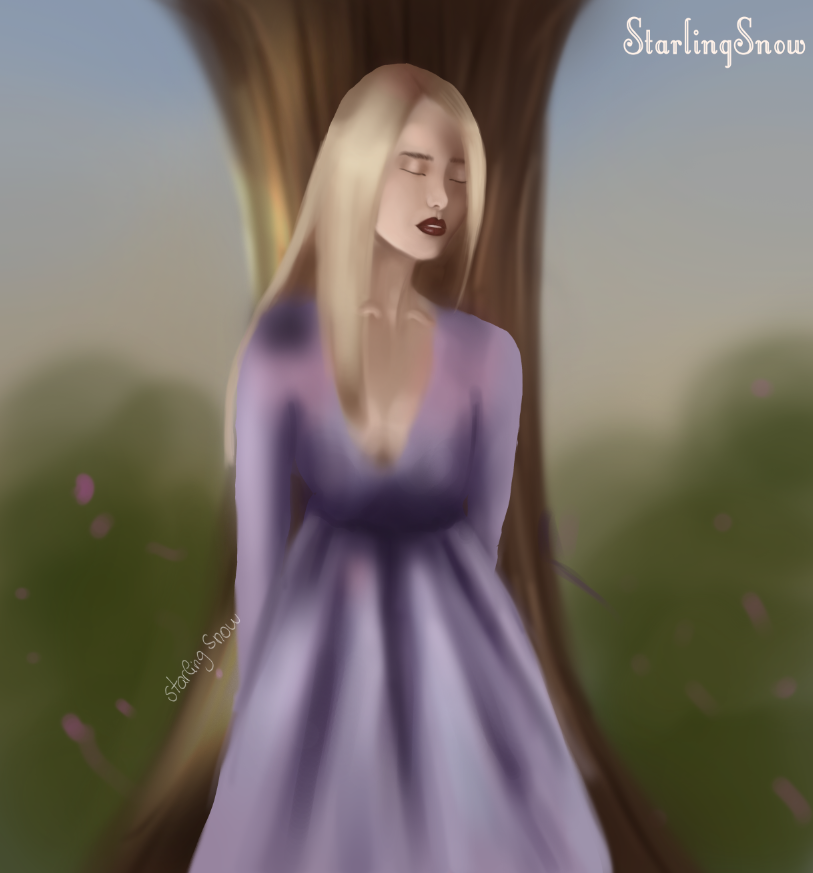
I chose my fan art of Princess Bubblegum and Lumpy Space Princess, since it was a simple process and I liked how it turned out (which is honestly a bit rare).

So let's start!

 I. Greyscale sketch base

Some people start coloring their pieces from their lineart sketch, color blocked shapes or just loose lines to contour the main parts of the piece. 
From my experience throughout all these months, what I realised that works best for me, is to color from a greyscale painting. Greyscale is often advised for beginners to practice understand values and form. Personally, I prefer greyscale because I like to have a somewhat of a visual of what my final painting might look like.


II. Base colors

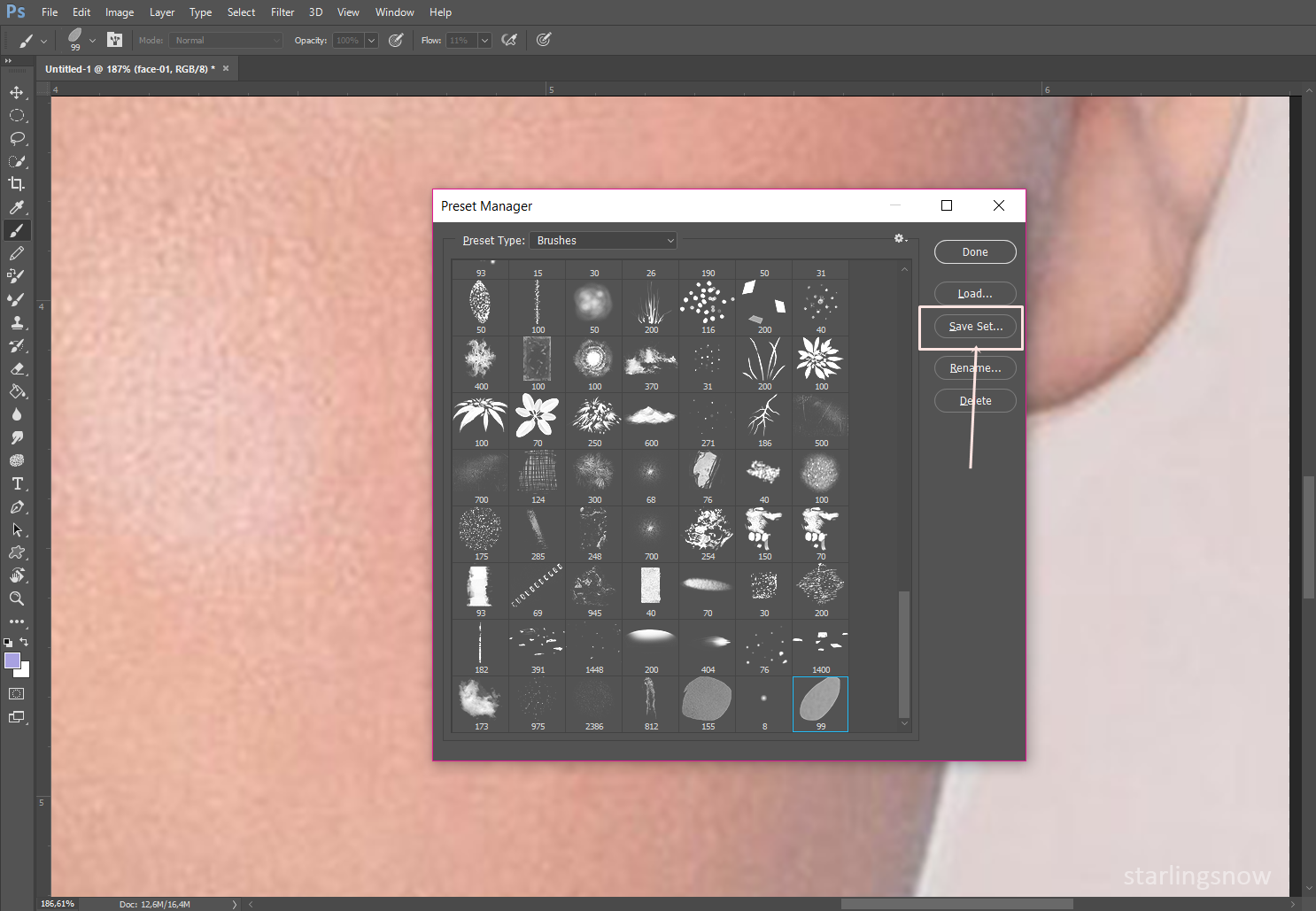
There are many many ways to color a greyscale painting. Some of them being: gradient maps, color adjustments, layer modes, etc. When I start to color a painting, I usually like to add an overlay color mode, (other popular layer modes to add colors at this stage are the color, soft light and multiply mode) and pick a base color of each element of my painting. Here I used the Overlay for the hair and outfit and Multiply, with a bright beige color, for the skin.
At this early point, I don't really care much if my base color is on point, because I just want to have a foundation to work off from.


III. Skin coloring and Lumpy

Here I started to render the face by first clicking on the Lasso Tool and going around her face, so I could freely color it without going over the hair parts. I mostly just used normal layer modes and went over the skin with the Soft Light mode so I could give her some lighting. I also started to color her outfit and to be honest, it was very overwhelming to work with so many pink shades u.u
At first I was just gonna paint Princess Bubblegum, but as it was looking too simple, I decided to add Lumpy too! I started with a purple color blob and shaped it in a "fluffy" way with the Lasso Tool.


IV. Hair and Outfit

At first I struggled with making her sleeve look puffy, but references are always great and can help us get avoid further frustration!
I also fixed her bangs and painted some hair strings on the side so the hair wouldn't look stiff.
Some hair strings were shaped to go over Lumpy so there could be a cute interaction between the two characters. This also helps to make them "blend" together in the painting!
 V. More Rendering and Highlights
       
Highlights are always a fun part to me - there are times during the process of a piece that I  don't have too much faith on it, for several reasons, and sometimes just a few highlights can make a difference and make it come to life. For the highlights I used the Color Dodge layer mode and I went over her hair, crown and Lumpy. 
I usually paint in a semi realistic style and the way I found to make Lumpy belong in the painting (since it's not human), was to play around with shadows and lights.
As I decided to have a sky as the background, I filled the bg layer with some light blues.
VI. Shadows/Highlights, Adjustment Layers and Background

With a Multiply layer mode, I darkened around her face and throughout her hair. With an Overlay and Color Dodge layer, I went over their head to give a "magical" aura and a few highlights on Bubblegum's skin, hair and face! 
I also used a Brightness/Contrast adjustment layer to darken the characters, thus making the background appear lighter. With Color Balance, I fine tuned the overall colors.
For the background, I added a few clouds and some flower petals as it's a really good way to fill some negative spaces without causing too much distraction.
Finally, I duplicated the whole painting into a new layer, used Gaussian blur and changed the layer mode into Soft Light with the opacity reduced.


And that's it! Not very complicated. If you'd like to check out a more detailed process, the PSD file for this digital painting, is up on my Gumroad here! :)

I hope this can be of some use and if you have any questions, be sure to ask! :)

See you soon! <3

Please subscribe to my blog's newsletter, so you can keep up with my blog posts and follow me on social media!
IG | YT | Gumroad | Prints

July 2, 2018

Hello everyone! :D How was your weekend?

To start off the week, I rescued an old sketch and turned it into a starting base for this digital painting. I really love working on bigger pieces since it allows me to have more room to create the outfits, but it can be quite time consuming which conflitcts with the amount of content I, ideally, want to put out on a weekly basis. 
This was really fun for me to work on and to try out a different pose. I hope you like it! <3
If you'd like to see the process behind this piece, I have the full layered PSD file as well as a step by step png up on my Gumroad!
I'll see you soon! Until then, have a good one! :)

Please subscribe to my blog's newsletter, so you can keep up with my blog posts and follow me on social media!
IG | YT | DevianArt | Gumroad

April 4, 2018

Hello!

Lately I've been experimenting a lot with new painting approaches, especially with the many ways Photoshop allows us to place color. I haven't recorded my painting processes in a while, but here are a few step by step phases of this painting! :)


 Please subscribe to my blog's newsletter, so you can keep up with my blog posts and follow me on social media!
IG | YT | DevianArt | Tumblr


March 16, 2018

Hello everyone!

As I mentioned on a previous blog post, I will be making a monthly tutorial or step by step digital painting process, and this time I decided to make a short tutorial on how I paint my digital portraits/how I paint skin. It's a bit hard to describe at times certain steps, so please bear with me! :D 

On this tutorial I used Photoshop, a Wacom tablet and only three PS brushes for this: the round brush, airbrush and a dotted brush for the freckles.

Let's get started!

I: Here I start with a plain base colour. I have the main colours swatched so you can pick them if you'd like.

II: Now, I map out where the shade and highlights were initially going to be. I'm not too strict about these shades I'm choosing, since what matters at this early stage is to have a nice base of colours to work from. However, it's nice that they still look like they belong together and that their saturation and hue isn't too far off from each other.

III: Two more shades are now introduced to build up the skin shades and its rendering: a dark brown and a nice dark pink shade. Keep in mind that as I use the pen pressure, the opacity of the darker pink won't be shown in its full force. 
I also outlined her face features with the dark brown as well as around the face. The key is to build the contrast between colours so it gets to the point where we don't need the sketch lines anymore when the face features are visible in form on their own.
IV: With a very dark brown colour, once again, I outline the face features and start to render the eye. The the initial highlights are also blended with the other shades.
 
V: On a Multiply layer mode, with the lightest colour of the swatches, I darken around the face, neck and shoulders. Here, I fixed the position of the lips and render them a little bit. Once again, blend, blend and blend all the current shades on the face until they start to shift into each other nicely.

VI: On this step, I fixed her eye position, which was a bit skewed before and fixed her hair colour since it complements her better. With a dotted brush, I placed some freckles on a new layer and lowered the opacity. I also played around with the the Colour Balance adjustment layer until I was happy with the overall skin shades.
VII: With the Colour Dodge brush mode, I place some little highlights on the eyes and lips with the lightest colour from the swatches. For the lighting casting on the character, I chose a dark purple to make it a bit fun. Speaking of fun, I also painted on her an elf ear 'cause why not!

VIII: When it comes to the skin, the last step is already quite finished, so this is just an extra effort if you'd like to go a little bit further. I used Selective Colour to fine tune each colour and I merged all of the layers into a new one and used Gaussian Blur. On this same layer, I selected the Soft Light layer mode, so it gives her a softer and richer look in terms of colours.

And that's it! 

I hope you were able to take something out of this skin tutorial and that you have fun with your experiments!

I'll see you next week with some new digital paintings that I'll be posting.

In the meantime, please subscribe to my blog's newsletter, so you can keep up with my blog posts and follow me on social media!
IG | YT | DevianArt | Tumblr

February 15, 2018

Hello guys! How have you been?

As someone who loves seeing "behind the scenes" of digital painting's final result, I bring you another step by step process with commentary of my latest piece.
I haven't done a step by step process breakdown in a while and I've been thinking on making some sort of digital painting tutorial at least once a month. So if you like these type of posts, then please stick around! :) 

Now onto the step by step!

I: First step, of course, the sketch. For these last few months I've been making an effort to actually draw my concept instead of going straight to colour block on Photoshop and just figure out what I want to paint as I go. It keeps my mind a bit organized and with an initial vision to go on from.

II: Here I lay out the base colours I plan on using, to briefly test if they work well or not. The only colours I already had in mind were the ones for the corset and her dress, and the rest of the colours would be whichever would complement these later on.

III: Then I started to work on my base colours by adding some slight shading to create form. For the background I used Curves and came up with that green/blue/yellowish mix of colours that I really liked.

IV: With the Multiply brush mode I darkened the before slight shading, so now there is more contrast between colours. I added some folds to the dress and some details on the limits of the corset.

V: At this point, as things were relatively put together, I was able to turn off the sketch layer and step away from it a bit. As you can see, I made some changes to the face when it comes to the face shape and eyes as I noticed that these were a bit too big and high in the face. I also added the strings of the opening of her corset and placed some more shades to her hair.

VI: The face was once again altered by giving her an oval shaped jaw line and by closing her eyes in order to make her look dreamier. I rendered the fabric of the corset (reference helps a bunch!) and the dress. For the background I used the Overlay brush mode to intensify the colours.

VII: Here I blended her skin, highlighted the face and fixed her chest area, so it looks like it has volume. When it comes to her dress, I painted some details and with the Multiply brush mode, I intensified the shading of her clothes and skin. I also added the tree branch behind her just like in the sketch.

VIII: Looking back, it seems like a big jump from the previous step to this one, haha! But there really isn't; here I just used two adjustment layers, Brightness/Contrast and Colour Balance until I was happy with the overall feel and colours. With a Colour Dodge layer I added many highlights throughout the whole painting (on the hair, body, outfit) and I placed some butterflies on the background so I could fill the entire space.

IX: And here's the final result! I worked a bit on the ambient occlusion and used Brightness/Contrast once again. Also, with a Lighten layer I placed some colour on top of the tree branch so it looked a bit more mysterious and like it belongs to the painting's enviroment.


If you'd like, you can see the final result's full size of this digital painting here on my DevianArt page.

I usually record my process, but this painting was meant to practice and try out some new things. 

However, I frequently post many videos on Youtube showcasing the process of my other digital paintings which you can find here

I really hope you enjoyed this step by step! You can check out previous one I made some months ago here!

I will see you at the end of the week with a new digital painting! 

Have a good one! :)

December 10, 2017


Hello once again! As I mentioned on my previous post, I'll be posting the step by step process of my recent digital painting "Prairie". It all started when I was practicing anatomy from a reference picture I found on Pinterest. Sometimes when I see a pose I start to visualize a whole other setting and context to it. And that can be used as a trick for when we lack inspiration.


When I settled on the theme and scenario, I went on Pinterest again to find inspiration for her clothes (dress and shoulder piece). I think it's great to have something to look at that relates to what you are painting so you can get your ideas flowing. Just try to not get stuck on what you see too much. Make experiments and transform - make it yours.

PAINTING

I: On this first stage I place the base colours. Make sure there is enough contrast between these. You should check the values throughout your work progress. Just use the Black and White adjustment layer and tick on and off this layer as you go.

II: Shadows are now added. I like to go with a darker shade from the base color but with a different hue. For example, the base colour is a very light peach, but the darker shades are variations of dark pinks. There are many ways to paint skin and to choose its shades, it all comes down to preferences and other factors.

III: The background idea remained the same from my first attempt at painting this sketch. A prairie with a few flowers during daytime. I started to refine the dress and accentuate the folds of the fabric. Here I also did some variations with the colours. Instead of just using light and dark blues, I picked shades of purple.
IV: At this point I start by going over the linework. Little by little I start to refine the edges that are represented by the sketch lines. The skin colours that were already placed are now blended and her face features are more proeminent. After some playing around with the dragon scales from the reference picture for the shoulders, I decided to go on a different route.

V: Here I coloured the shoulder piece and gave it a metallic look - same as her waist accessory. As for the background, I used Selective Colour to fine tune the colours. The trunk was also rendered by adding greys and browns - as it wasn't a very important element I kept it simple enough to look like a trunk and to not be distracting.

VI: The whole image was adjusted with the Brightness/Contrast adjustment layer and the hair was taken care of by being painted with a darker colour and given some hair strands illusion.
VII: With an overlay layer and with a soft brush I go over the landscape and start to add the sunny atmosphere. I make sure her hair also has some of that light. Then I selected all of the background layers and merged them all together to apply a Gaussian blur filter.

VIII: After my boyfriend pointed out that her leg was looking a bit off - Sometimes we are so eager to finally finish or we are looking at the same painting for so long, that it is very easy to overlook details like these. Ask someone you trust to help you point out any mistakes. - I fixed it by taking a look once again at the reference picture. I also added some fabric from her dress on her right side to give it more dimension. With a cool sun ray looking brush I have on my brushes folder, I tried to represent the sun rays and it gave the picture a more striking look.

IX: On this final stage I applied a Multiply layer to darken her right side and "behind" her leg so there could be more depth. Some sparkles were added on her dress to make it a bit more fun. With a Color Dodge layer I add some highlights to her skin. When it comes to adjustment layers I used once again Brightness/Contrast and went with Vibrance to make the colours pop.

Afterwards I painted her ear and softened up her face a litte bit and I was finished!
You can check the full finished picture on my DevianArt here. :)

PAINTING PROCESS OVERLAY - GIF 

To briefly timelapse all of the steps until the final result, here's a gif for you!

If you like to watch timelapsed painting videos, I also recorded this process. You can watch it here! :)

I hope you enjoyed this post! I always have fun writing these.

See you next week!

October 18, 2017


Hello! Today I thought I should share what I've been learning to do - how to animate in Photoshop!

On this sort of mini guide, I will be animating a crying face which is quite a simple concept. I've been watching so many cute short story animations on Youtube that have really inspired me to do something similar in the future.

But I'll start simple on this one. Step by step until I am able to do something more substantial.

                                                                                                                                                    
For this case in particular - an expression - we have to keep a few things in mind:

1 - Think of the first and last expression (neutral face - crying face)
2 - Think of the slow motion movements between the start and finish (in betweens)
3 - Be mindful of what moves (eyebrows, cheeks, muscles... ) along with the main expression. The more you tweak those details, the more believable the animation will be.


It really helped me to sketch just the initial and final expression and then work my in betweens from there. Also, although it can sound silly, you could photograph your face for reference by making all of those micro expressions contained in one expression. Or just film it and then make it slow motion.

This quick crying face animation I did has 5 steps that I'll be explaining below.


I - Initial expression: neutral eyes/eyebrows;
II - Watery waterline by adding a very light grey shade;
III - Eyes starting to close down with some indication of tears and the inner side of the eyebrow starts to raise;
IV - Eyes starting to close down even more with actual tears on her face and eyebrow slightly raised again;
V - Final expression: tears running down on the face.

                                                                                                                                                   
Now onto the fun part where it will all come together!

In Photoshop click Window<Timeline. A pop up window will open, so click Create Video Timeline. Here all of your layers will appear And now it's up to us to arrange them the way we want.

From left to right and from the bottom to our way up in the timeline is the order of our animation.


I think this is quite self explanatory as a way to understand how the layers should be placed. Keep in mind that the layer's duration should be the same. 

To export just click on that arrow at the bottom of the left side next to those 3 squares.

And here is the final result!


This was my first try at animating so it's quite far from perfect, haha. Over time with more practice the imperfections will be more polished.

Still, I hope you enjoyed! :)

September 23, 2017

Hi! :)  I recorded this painting short hair hairstyles type of thing and I'm releasing for free the PSD file with all the layers of the process on my Gumroad page!

Here's the link if you're interested: https://gumroad.com/starlingsnow#

And of course, you have the video timelapse available to watch!

Hope you enjoy!

September 6, 2017


Hey everyone! What have you been up to lately?

I personally have been inspired a lot by other artists on DevianArt. Lately I've been drooling over the digital drawing and painting techniques and polished pieces by Sakimichan. I've known her work for many years, but only lately I've been looking at it in a different way - as in aspiring to look forward to achieve  the same results one day.

And as a consequence of being inspired I started to doodle some things and experimenting with tools that I usually don't use. I ended up so caught up in it that I spent hours and hours on it. As it was supposed to be an experiment I didn't record the process, so I thought I could share step by steps of it along with some comments and thoughts!


1. Sketch

My sketches are usually really rough. I usually like to go straight to color blocking and work my way from there, but it's always useful to have some guiding lines. Also, I sometimes refrain from sketching because I don't have a clear idea of what I want to paint - and even when I do, it's common for me to alter the initial concept due to new ideas coming up.
Here I was initially going with a princess-like character with flowers around her and nature as a background. But soon what I had pictured in mind took off into another direction!


2. Color Blocking

At this point I start to lay out the colors I want to see on this piece as well as some shy shading colours and lights. For some reason I always fall into the purple/pink/blue color combo trap! These colors are my favorite to put together, so I often use them as my main colors.


3. Initial Refinements

Here I start to paint on top of my sketch layer. I try to give the tree trunk a wooden feel and appearance to it by alternating the light and dark brown lines and color dodging on the side to give the sensation of the end of the day approaching. 
The dress has already some deep shadows on and the face features are refined.


4. First Drastic Changes

Making changes can be a hard decision when you've already put effort into something. It can be worth it if you go through it though! I was unhappy with her expression and a simple smile/lips alteration in shape and color was all it took to give a friendlier and warmer look to her face.
The dress I painted her on before didn't feel too princess-like so I changed it into more of a fantasy-ish style.
When it comes to her hair, you can see that I changed it from its initial shape and I start to add hair strands to give the illusion of actual hair.


5. Starting to Look Put Together

Here is when things finally start to look put together! Starting with the dress, I changed the colors to a blue-ish grey muted tone by using color and overlay blending layers and then gave it a voluptuous shape at the bottom.
Volume was also added to the hair along with different blonde tones. This romantic hairstyle gave her a very mellow look which I really liked.
The anatomy was also fixed (shoulders, waist, chin and nose). Now her face features also have some highlights and the skin colour looks more realistic by shifting her midtones to a rosy hue - this was achieved by using the color balance option.

Fun fact: at this point I was painting this giant tall tree behind her and I was thinking that it would be  really cool to have this long vertical painting. But then it looked a bit off having the tree take so much attention from the character when zoomed away. So I erased it and augmented her size instead. One day I will explore that option again in another piece!


6. Working on the Background

I decided that this painting would be set at sunset so i painted the background's sky accordingly. With a layer set on multiply I put a shadowy area at the bottom of her dress and around it to give the image more depth.
I was experimenting with some things coming down from the tree and this is what I came up with - some little flowers that lighten up which are a great excuse to use some reflected light on the character thus making her belong even more to the scene.


7. Effects and Final Results

At this point all I did was enhancing what was already there. I used color balance, layer blending modes set to overlay, soft light and multiply for shadows, lights and atmosphere, chromatic aberration and gaussian blur around the character. And 4 hours later or so I am done!
 __________________________________________________________________________

It's been a little bit more over a year since I started digital painting (at first with a mouse!) and it's seriously one of the best things I could have gotten myself into. It's so freeing and fun to explore options and your imaginary to translate it into an image. I'm still just a beginner and I know that there is still a long way to go. 

If you want to keep updated for more things to come, please stay around!
__________________________________________________________________________

See you sunday with my newest digital painting timelapse video! :)

In the meantime, you can find me on Youtube | DevianArt | Instagram | Tumblr 

- starlingsnow

July 25, 2017


It's only natural to feel the need to customize our brushes to fulfill our needs. Or even make our own from scratch! And that's what I've been doing lately. By doing so I came up with two brushes: one to blend the skin and another one to texturize it.

Here's another example of the brushes I made in action on my painting for this weekend's video.


I used the SkinBlend brush for the skin tones and the SkinTexture brush to mimic skin pores and for the glitter on the eyelid.

I've been really happy with them and if you wish to try them out you can download them from this DevianArt post.

Now for the tutorial!


How to Make Your Own Brushes in Photoshop

Step 1 
Find a texture for your brush. Here I chose actual skin as my main purpose was to make some skin brushes. However, don't feel limited. You can pretty much make anything and turn it into a brush - drops of paint, scan some leaves, flowers... you name it - and load it into Photoshop and select the desired area with the Selection tool.


Step 2
Go to the Edit>Define Brush Preset and click Ok.


Step 3
Open your Brushes folder and there you will find the brush you've just made! You can stop here BUT- I highly suggest you move on to step 4.


Step 4
If you click on that little folder the arrow is pointing at, you will then be able to customize the brush you've just made (and others you may have). Explore along with the sliders and all the variables and try it along. When you feel happy with it, click on Create New Brush (third icon on the lower part of the opened window).


Step 5
In case you want to make a bundle out of all of the brushes you made or you simply would like to group your favorite brushes, you can go to your Brush folder's Preset Manager and select them by CTRL'ing them and save the set.


Hope this was somehow useful to you!

If you can, please visit my:
YOUTUBE: https://www.youtube.com/channel/UCJ8vc4kbhF9DGP73wRwK6hw
DEVIANART: http://starlingsnow5.deviantart.com/
INSTAGRAM: www.instagram.com/starlingsnow/
TUMBLR: http://lightupmyspirit.tumblr.com/

Related Posts Plugin for WordPress, Blogger...